Hand Drawn Artwork
Pieces Featured on this Page
Without Computer Assistance
As the title suggests all of the portfolio samples included on this page are works I completed without the benefit of computer assistance, that is in some instances excluding a calculator. Some of the work is 100% free-hand, while other works are perspective drawings that were completed utilizing rulers, and additional drafting tools. Just as the appearance of artwork generated on a computer varies, so does the work that is generated without the assistance of a computer. Such variance is owed to the variety of techniques, subjects, and media available to the artist. The pieces I have chosen for this aspect of my portfolio demonstrate how much a single artist's work can vary depending on the subject and technique.
The Drawback to Digital Presentation
The variable aspect of hand crafted work can work against an artist desiring to display their work digitally; as it occasionally results in difficulties with obtaining the image quality necessary to view the piece(s) on the computer screen without subtracting from the appearance. The differences in media attributes and surface/paper size dictate that scanning the pieces may not necessarily be the best option to create a digital image of the work. The alternative to scanning a peice is to photograph it, accordingly some of the peices on this page are effectively pictures of pictures. Unfortunately this approach causes some of the work to be sightly distorted and not as it would appear in person. If you are interested in viewing the work I have completed by hand in-person, please contact me to make arrangements.
Perspective Drawings
Where Math and Art Meet
There are many individuals who do not realize the extent in which math (usually geometry) is an intregal part to most forms of visual art. Form, layout, and color are just a few aspects of an artpiece that can be influenced, even dictated by math. Perspective Drawings are one such example of an artistic form directed by, if not completely dependent on math for direction. A result of the very definition of Perspective Drawing, a system utilized to realistically render depth and height, representing the mannner in which objects appear to change according location. Objects closer appear larger, those further away seem smaller and closer together.
Like various forms of math, there is more than a one method in which an individual may choose to approach in creating a perspective drawing. If the subject being rendered is from a photograph, the artist might utilize the method in which the horizon line and vanishing points are found to direct the specifics of each line. If the artist is not looking to simply enlarge an image but create something new, either from multiple images or just their imagination, they may choose to make use of one of the many different perspective graph papers available.
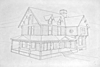
A perspective drawing of a house, created in 2010
The images within the gallery above feature drawings which were a part of the technical illustration course. They were the initial perspective drawings assigned to serve as a demonstration of the mastery of various aspects of perspective drawing: multiple points of origin and angles of perspective drawing.
The two-point perspective drawing of a house on the left is also a completed completed assignment for the Technical Drawing class I attended at Wake Technical Community College. This drawing is a scaled up representation from a picture, completed utilizing a ruler and the horizon line and vanishing points. Resulting in the most accurate rendering possible, allowing for human and instramentation error.
Still-Life Drawings
Overcoming the Intimidation
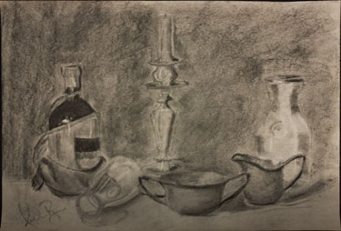
A Charcoal Still Life Drawn in 2010
Still-life drawings can be quite a daunting of task for an artist to undertake. There are varying schools of logic as to how an artist should approach producing a still-life. I choose to approach it with a one-step at a time kind of methodology of just drawing what I see. Starting with the most basic of shapes and developing each object gradually until it resembles real life. So for instance if I were to start working on a still-life of the stereotypical bowl of fruit, I would draw a light circle or ellipse to represent the bowl shape followed by drawing the basic shapes of the fruit going front to back. Believe it or not once the basic shapes are in their rightful places, the hard part is done. From that point it's all about observation, shading, the addition of any fine details, followed with rendering the background.
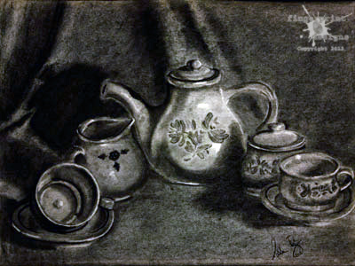
A charcoal still-life on newsprint, created in 2009
My Preferred Tools
When completing this type of drawing I prefer to utilize standard graphite pencil, or various forms of charcoal. These media forms are the most conducive for the artist to develop the picture from the simple to the complex, while also enabling easy adjustments and mistake correction.
About the Drawings Featured
This still-life was not completed as an assignment for a course. I set up this still life shortly after finishing my first drawing course taken as a part of the Advertising and Graphic Design curriculum at Wake Tech Community College. Having been limited to one class session per complex still life, I had a strong desire to prove to myself that I was more than capable of completing a complex still life. Therefore I set up this still-life of a teapot, creamer jug, sugar bowl, and cups with saucers. While the ability to create realistic still-life drawings is not a skill often sought, it allows me the opportunity to demonstrate an understanding of shape, shadow, and spatial relationships.
Conceptual Works
No Stranger to Graphic Designers
The ability to create conceptual works is paramount for graphic designers. Conceptual drawings/designs are developed through ideas and the imagination. In creating these pieces a designer's goal is to reference any specific project parameters and brainstorm and draft various solutions to the design problem. In designing conceptual work, the artist is given certain parimeters around which they design. This type of work is more outside-the-box, and most closely related to what graphic designers spend a considerable part of their careers doing.
Examining Design Process Relationships
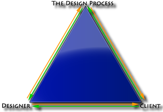
This chart demonstrates the relationships that were to be explored in completing the design process conceptual piece.
The following conceptual piece was an assignment in a Graphic Design course. The purpose of completing it was for each individual to examine the design process and the relationships involved in the design process. Due to the fact that merely describing the relationships to be considered and represented in this concept would be complicated and difficult for a reader to discern, I have included a chart (right) to give a simple pictoral representation to follow throughout the explainantion of this peice. Each arrow within the diagram is representative of one entity's relationship with another.
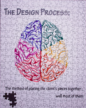
A Pen & Ink Piece that Examines the three-way Relationship between the Designer, the Design Process, and the Client. Created 2009
Initially, it was difficult to consider so many relationships at once, let alone how to conceptually represent them. As I considered the impact each entity has on the others, it occured to me that these relationships often function in a cause and effect dymanic. Once the relationship dynamics were established, a jigsaw seemed like the perfect metaphor for this process; which can involve a great many pieces or just a few depending on the design problem.
This was a somewhat introspective piece which made the designer look at their own creation process and their relation with it. It also was an examination of how the client has a potential impact on the creative process. As a client becomes involved within your creative process as an artist, the experience is similar to having all the pieces of three different puzzles dumped together right in the middle of a streamlined process. Though this may cause difficulties at times, it helps in coming as close as possible to ensuring a successful design. From the artist's perspective, more often than not the client either knows exactly what they want and just can't communicate it effectively; or they have no clue what they want leaving the designer to attempt to pull it out of them. However without client involvement, none of the puzzle pieces would ever fit together.
Personality in a Question Mark and an Exclamation Point
The question mark/exclaimation point designs were an assignment in a graphic design class. Without knowing any additional details the students were asked to pick 3 words which they felt best described their personalities. Upon choosing the descriptors it was explained that each student was to now generate concepts illustrating the chosen personality traits utilizing only the question mark and exclamation point.
- Personality Trait: Thorough
- Personality Trait: Creative
- Personality Trait: Witty
To demonstrate the thorough aspect of my personality, I channeled the logical, analytical, and precise parts of myself. This part of my personality is the likely cause of the enjoyment I find in intricities such as perspective drawing. As I considered this correlation it inspired a blue-print inspired detailed drawing.
Its not often that you see creativity in a question mark or an exclamation point...it seemed to me that true creativity would be to make these text objects dynamic and perhaps something more that what's really there. Instead of limiting myself to just one question mark and one exclamation point, I created a propeller type image with two of each punctuation mark.
Finally for witty, I found inspriation in my my often dry-quick witted sense of humor and did the opposite of taking the instructions literally drawing a question mark and exclamation point as two separate entities. Instead I shaped the question mark and exclamation point together to form a single entity.
Across Conceptual and Realism
Pen and Ink Pieces
Pen and ink peices are traditionally pieces with a final rendering completed utilizing black ink pens of varying sizes. These peices can feature an infinite number of subjects and have a wide variety of applications; as they can take a conceptual or realism form. Therefore instead of having separate pen & ink, and marker galleries, I have combined the pieces here according to the media utilized to create them.
The contents of my pen and ink gallery offer a good representation of the varied applications of pen and ink media; as it features conceptual peices with business applications as well as conceptual work with artistic purposes.
- 24 Hour Film Festival
- Stippled Frog
- Exploring Pen Strokes
This 24 Hour Film Festival logo is one of the first logo assignments I received in my attending a Graphic Design Program. The requirements of the assignment were to create a logo for a 24 Hour Film Festival that could be presented in strict pen and ink; the final image had to include at least one triangle, circle, rectangle (or four sided figure), crescent shape, and the number 24 in some form or fashion.
The Frog image was created through the stippling technique. Stippling is the utilization of one or more pens of various sizes to create content and form. Often the artist will lightly sketch the basic aspects of the subjects form as a guide for the actual stippling. Rapidiograph pens are often the tool of choice in projects such as stippling, as it allows more control over the "dot" sizes. Unfortunately this example does not have the benefit of Rapidiograph Pens, it was completed with a felt tip pen.
The last peice is a picture of a monk in which is an exploration of various pen and ink strokes and methods. There are five or so different pen strokes utilized in this piece, these varied pen strokes create an intriguing image. The strokes allow for the entire image to be shaded by black pen and ink in one way or another, while also maintaining a distinguishable difference between elements.
Prismacolor Marker Pieces
Like basic black and white pen and ink peices, Marker peices vary greatly based on the content and form of the subject of each peice. The peices featured within this section were created utilizing a set of Prismacolor markers which have a broad tip at one end and fine on the other. These markers are alcohol based, and are often utilized in various commercial art arenas. For example Primacolor markers are utilized in creating conceptual drawings by architects. This ability to be used in realistic renderings is what separates Prismacolor and Copic markers from the everyday Crayola Markers. The artistic markers can be blended and color over another color to enhance a drawing while the good old washable markers would result in the opposite in mixing the colors. This can be one of the most tricky rendering methods to master, however with experimentation and practice the results can be quite surprising. It is very enjoyable working in both prismacolor colored pencil and markers, and hope to have the continued opportunity to develop those skills in my career.
- Text Illumination
- Self-Portrait
- Original Comic Strip
- 24 Hour Film Festival:
Color Edition - Geometric Series
The piece with calligraphic style text is my own interpretation of an Illuminated Text. An Illuminated text is a decorated text, most often illustrated according to the text content on the page. Accordingly so as the qoute featured on my piece references The Wizard of Oz, the Illuminated text revolves around that subject. This Illuminated document is based on the concept of the books which were transcribed and illustrated by European monks before the invention of the printing press. These Illuminated books are now considered historical artifacts and the most common example being the Bible.
Next This self-portrait was completed utilizing the mirror method, meaning that I set up a mirror adjacent to my workspace and referenced my reflection to "draw what I see." All self portraits are challenging to say the least, but the mirror method is partictularly so. One of the most frustrating complications is that the subject does not stay still, as the artist has to look up to view the reflection then down on the drawing surface which ultimately results in some inconsistancy. To avoid re-starting numerous times, I began with some preliminary sketches in a sketchbook, did some detail refining and transferred the refined image onto the less forgiving bristol board surface.
he comic strip was an assignment for a mixed media class. The students were tasked with creating their own comic book hero, and then creating a six frame strip. My comic book character ia Pathos the Visionary. Amoung his "powers" were those of of premonition and empathy. This was first completed as straight pen and ink, then was colorized utilizing prismacolor markers.
A color version of the 24 Hour Film Fesitival Logo originally featured within the pen and ink gallery. In colorization of a logo it is important for the color(s) chosen to fit themeatically and be limited in number. In addition to black this piece technically features three different hues (name of a basic color) of ranging values (scale of lightness or darkness). The colors chosen work together to represent the overall concept of a day and night film festival.
The two geometric renderings are companion pieces inspired by illusion illustrators MC Escher and Sandro Del-Prete. The first is primarily in pen and ink with Prismacolor accenting while the second is wholly rendered utilizing Prismacolors. Both images utilize the same markers, only in different places within the drawing. As companion pieces these renderings were created to be view together as they are presented in the gallery. In viewing them together both drawings enhance the effect and appearance of the other.
Sketchbook Work
Keeping Skills Sharpened
Similar to a Sword needing a whetstone, and a mind needing books to stay sharp an artist needs their sketchbook to hone and maintain the most basic of their skills. Many designers, myself included carry a sketchbook of some form/size with them almost everywhere. I do this just in case I find myself inspired with an idea for a project on which I am currently working, also I carry a sketchbook around in the event I find myself having to wait on something and can take advantage of time otherwise wasted. I have included pictures of a few random sketchbook pages. Usually one sketchbook page for me will feature numerous drawings of various forms. These featured here mostly focus on human facial features, often one of the most difficult subjects to render...as a result I think it best to practice working on facial features often. With the exception of the first drawing on the left these are just random sketches. The Drawing of the Chicken, Cat, Dog, and Pig was an assignment for a mixed media course, in which the students had to illustrate the story of "The Little Red Hen."
I have included these images from my sketchbook as I believe it important to demonstrate that even when there isn't a job to work on, I am always busy refining skills in one way or another.


